For anyone that uses Yahoo, you may or may not have noticed something different every day you went to check your email or read the news. Yahoo has decided to change their logo, but unlike most companies or organizations, it wasn’t a sudden change to one new logo. Instead, they decided to cycle through 30 different examples; a different logo for each day. None of those logos included the outgoing logo, although a couple were similar. They finally unveiled their permanent logo today.
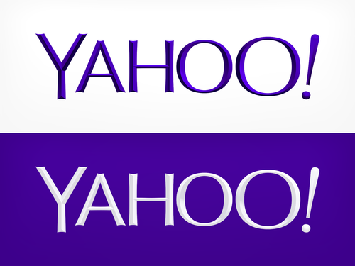
It is a new sans-serif typeface created by Yahoo in-house, and it’s only part of a brand new branding and image campaign. The logo was last updated in 2009, and that logo wasn’t too far from the original 1995 logo. It would be interesting to see if another company or organization pulls off a similar ad campaign that stretches out over time.
To see the other logos leading up to the final product, click here.